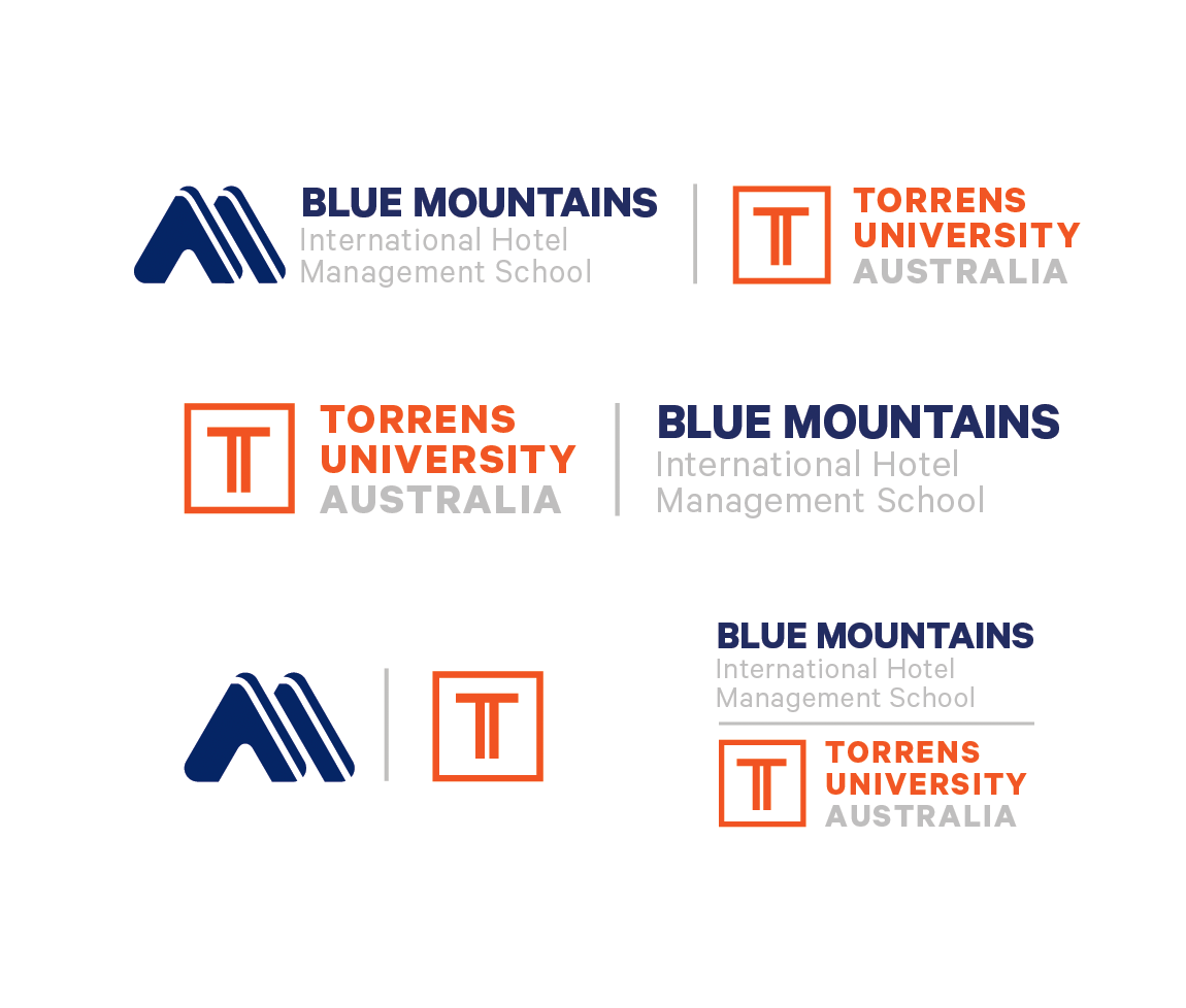
The main issue in this work-integrated-learning project, was that the existing brand looked too similar to the parent brand and as result was being smothered. The client wanted something distinctive yet harmonious with the parent brand, and speak premium yet also warm and approachable.
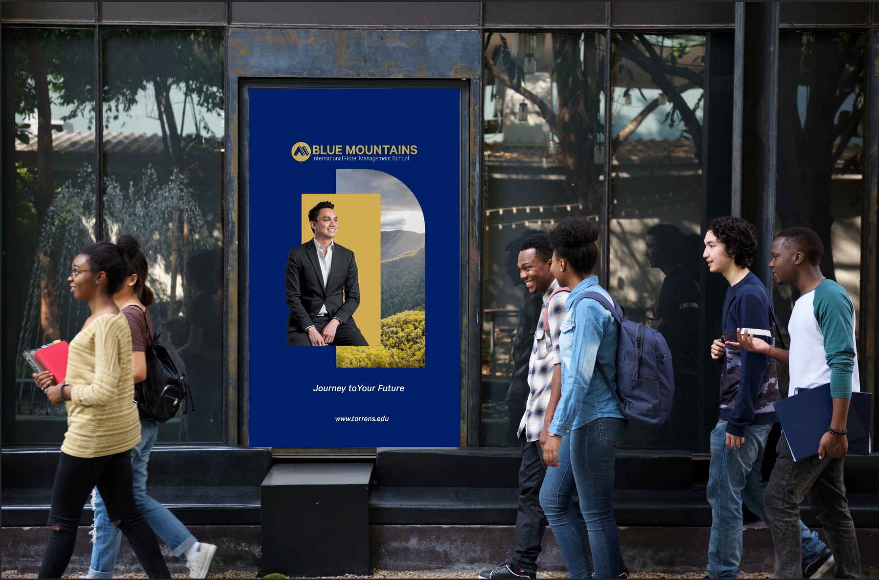
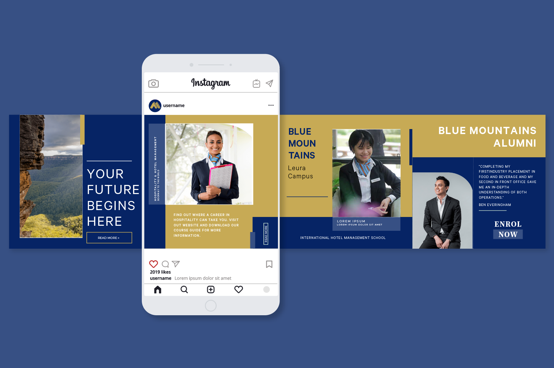
Inspiration came from the Blue Mountains region which their undergraduate campus was located., and the region's topography became the analogy for the layers of elements that contributed to the rich educational experience that the school offered to its' students.