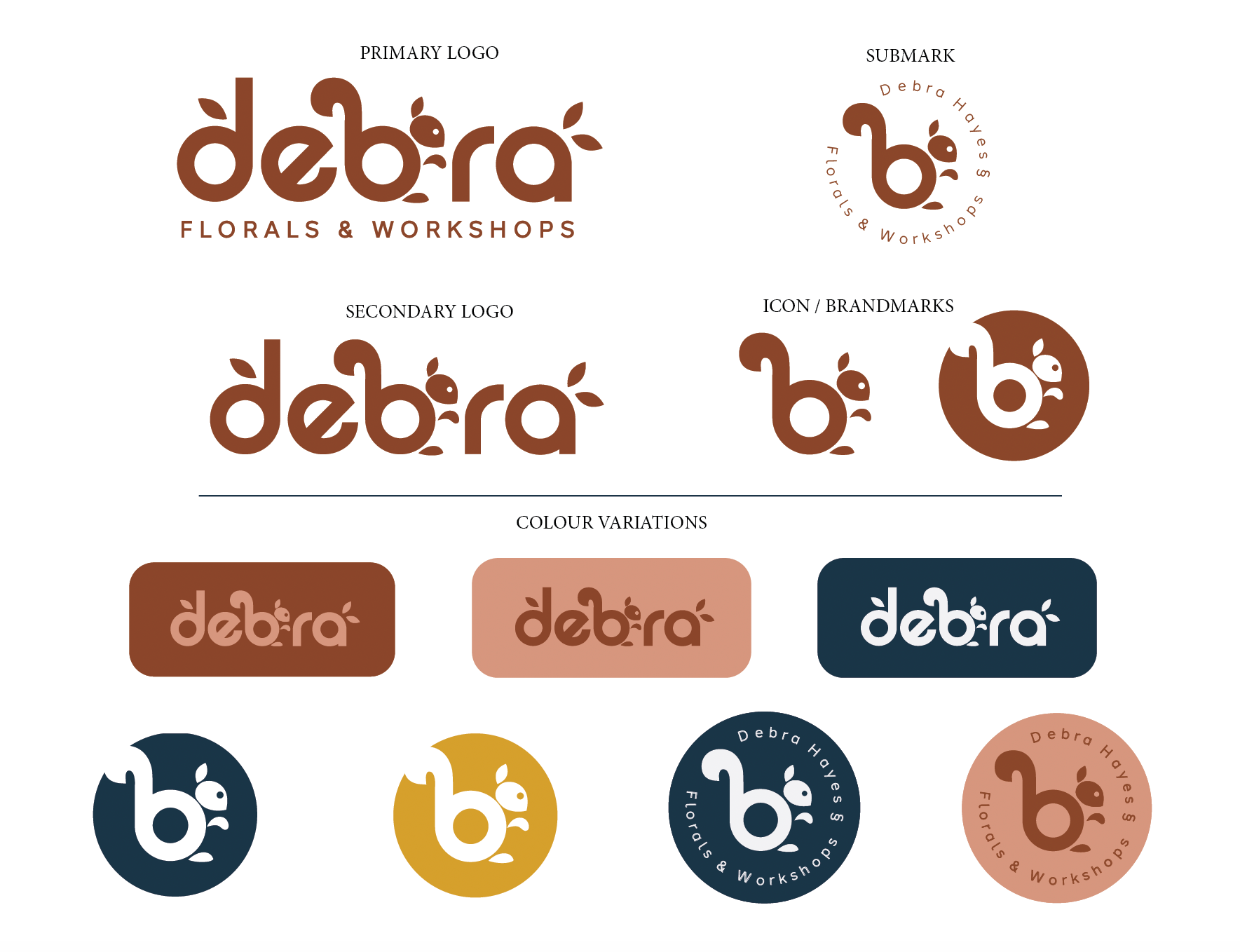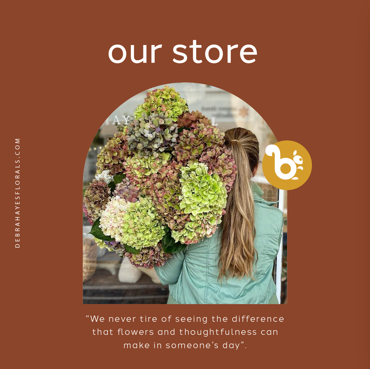
A university assessment, I chose to give new branding to this florist shop. Their original brandmark was a run-of-the-mill serif typeface in grey. It did not visually convey the owner’s motto, “We never tire of seeing the difference that flowers and thoughtfulness can make in someone’s day” and I wanted to inject some personality into it.
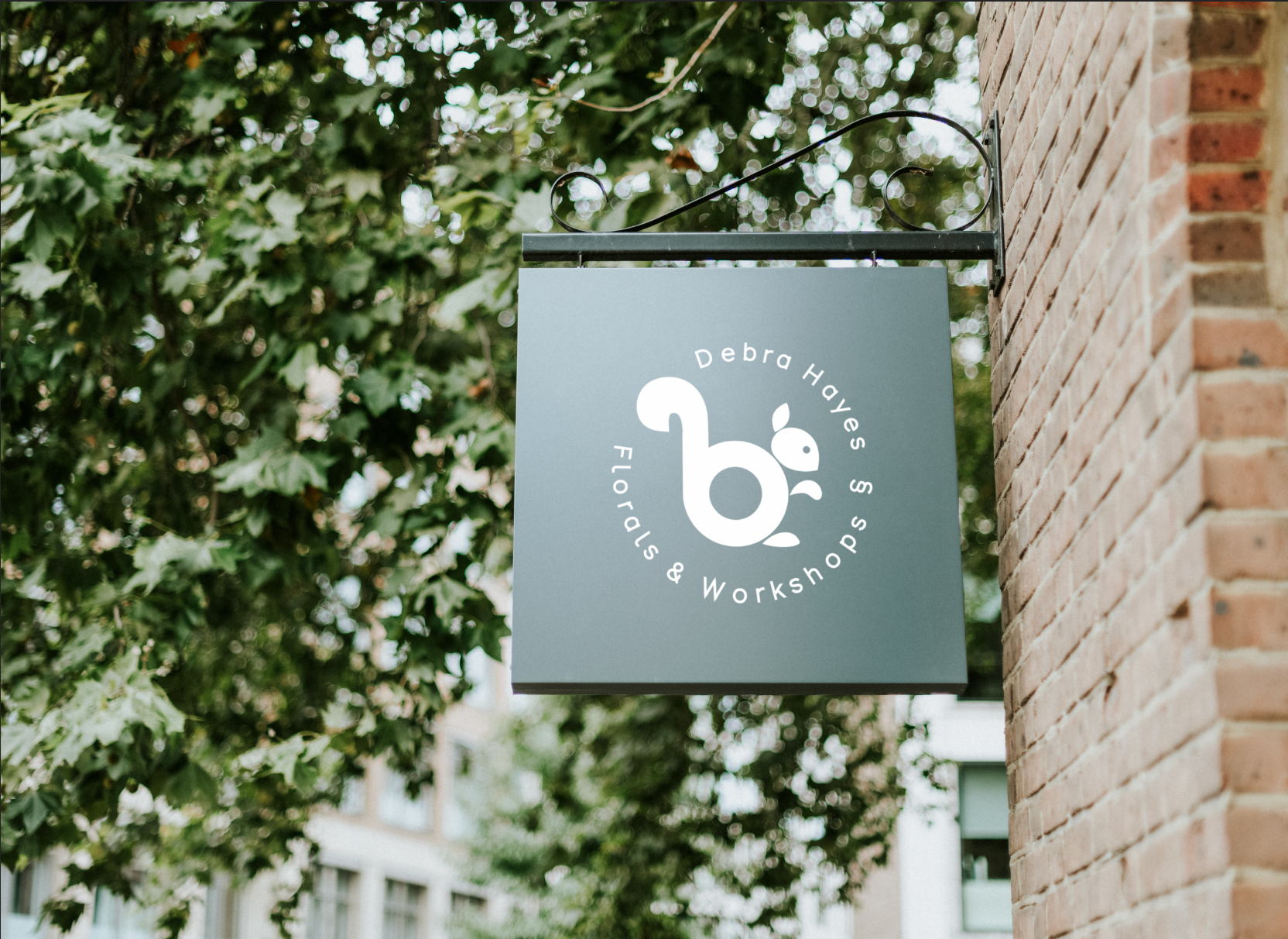
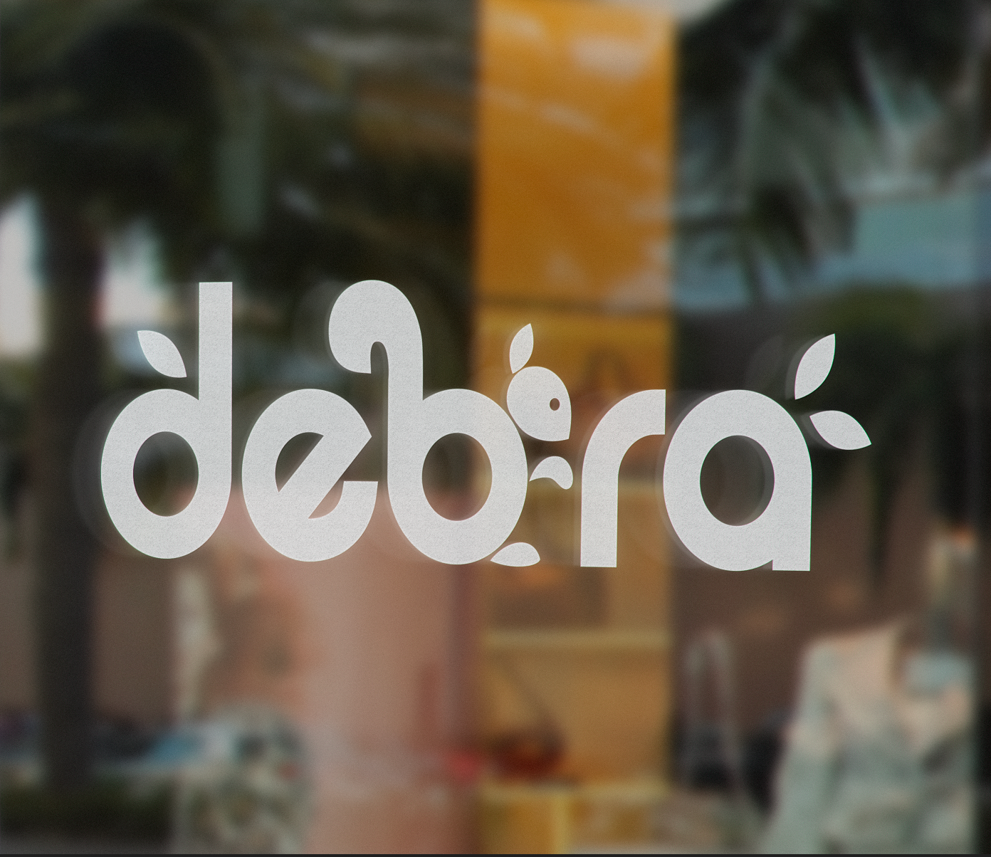
Inspiration came from the autumn colours and woodland critters. The chosen colour palette conveys the warmth and personable approach of the owner. And the squirrel graphic adds a touch of whimsical.