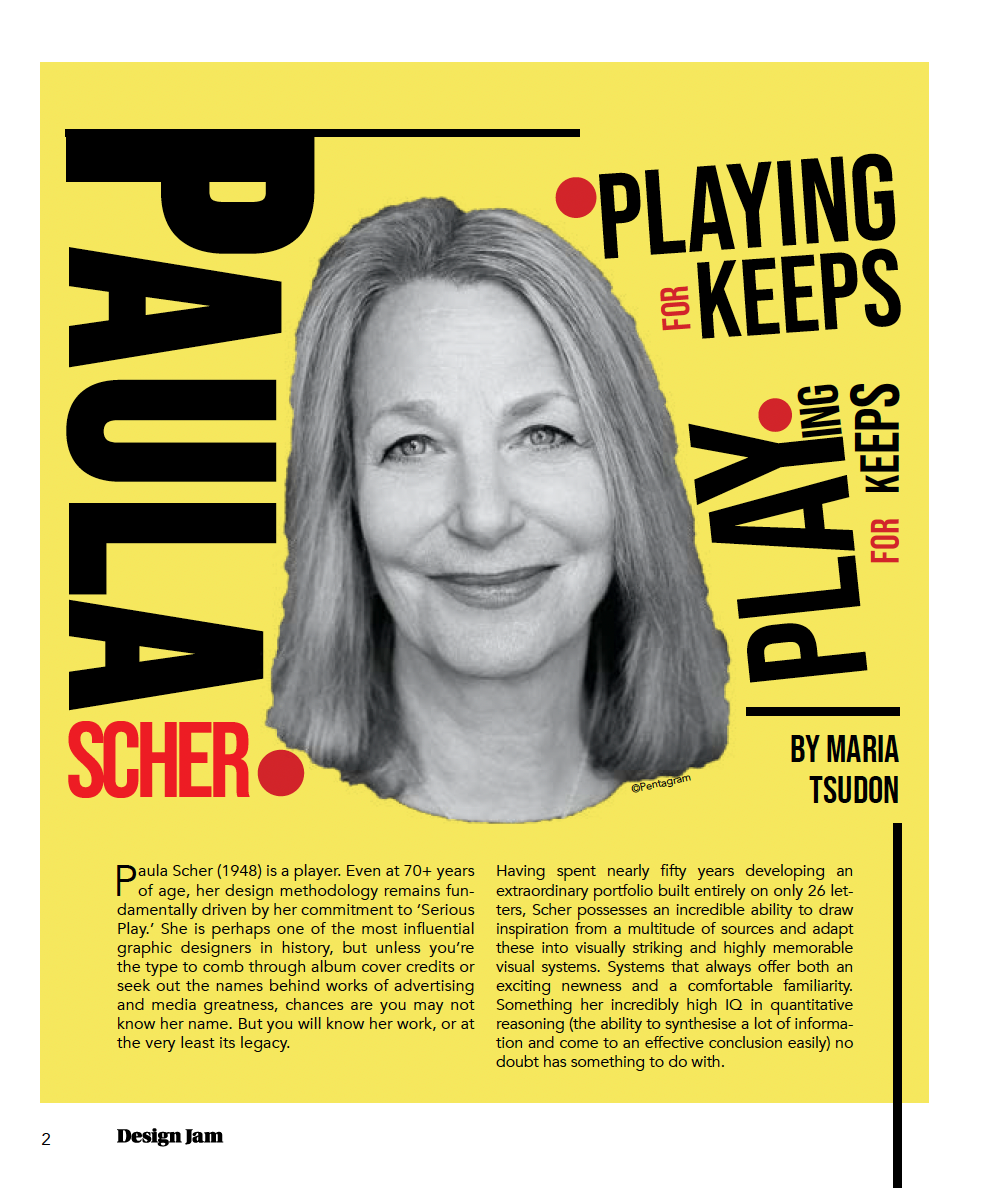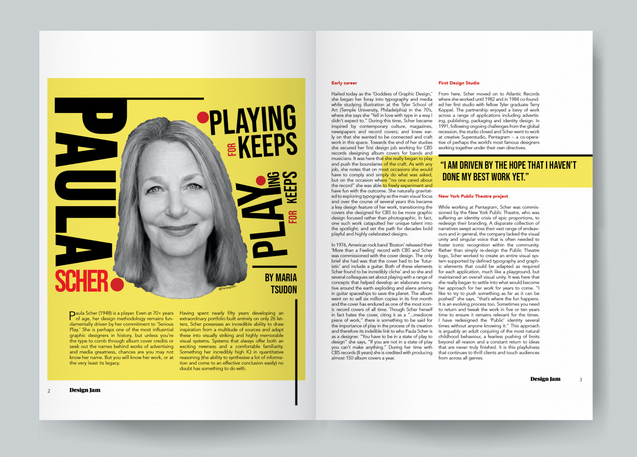
A university project, the assessment required use of a supplied copy to create a two double-page spread to demonstrate the principles of page architecture and typesetting. I chose the editorial copy about Paula Scher's career and went about designing a layout that would point to her style of work and engage with the viewer.
Inspiration came from Scher's iconic “Bring da noise, bring da funk” poster. A bold colour palette, blocky sans serif fonts, image-typography interaction, and typography functioning as graphics, were applied to the final design to mimic her iconic poster.